Chapter 10 Correlation
Now we consider the situation where objects are sampled randomly from a population, and, for each object, we observe the values of random variables \(X\) and \(Y\). Therefore, unlike regression sampling, where the values of \(X\) are chosen by an experimenter, both \(X\) and \(Y\) are random variables. Unlike a regression problem, we treat \(X\) and \(Y\) symmetrically, that is, we do not identify one variable as a response and one as explanatory. We are interested in the relationship between \(X\) and \(Y\). How are they associated, and how strongly?
When estimating correlation from data we will concentrate on the sample correlation coefficient \(r\) defined in equation (2.1) of Section 2.3.5, which is a measure of the strength of linear association. However, the general comments that we make will also apply to Spearman’s rank correlation coefficient \(r_S\) (also defined in Section 2.3.5.
10.1 Correlation: a measure of linear association
UK/USA/Canadian exchange rates
Figure 10.1 is a plot the UK Pound/Canadian dollar exchange rate vs. the UK Pound/US dollar exchange rate for each day between 2nd January 1997 and 21 November 2000.
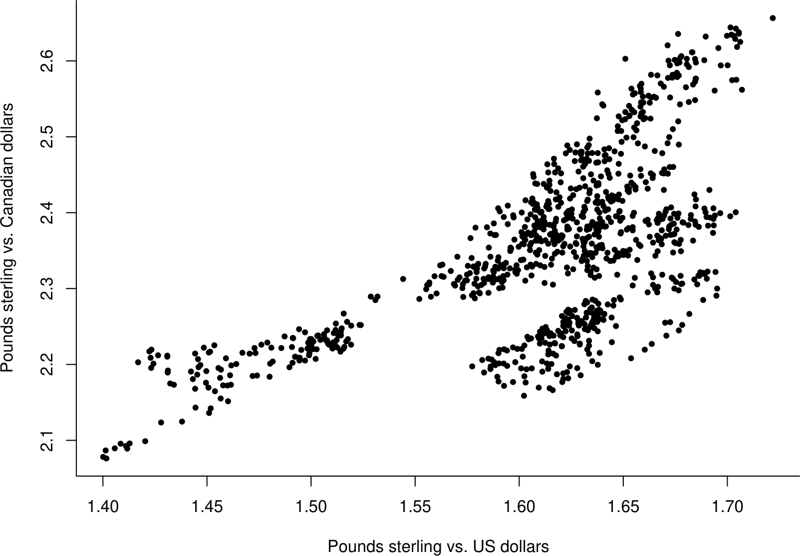
Figure 10.1: Value of 1 UK pound in Canadian dollars against value of 1 UK pound in US dollars.
The relationship between these two variables is complicated. However, when dealing with exchange rates it is common to (a) work with \(\log\)(exchange rate), and (b) use the change in \(\log\)(exchange rate) from one day to the next. This produces quantities called log-returns. In Figure 10.2 the log-returns for the UK Pound/Canadian dollar exchange rate (\(Y\)) are plotted against the log-returns \(X\) for the UK Pound/US exchange rate (\(X\)).
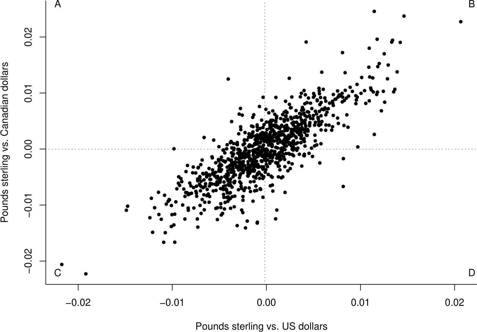
Figure 10.2: Plot of \(Y\) against \(X\). The vertical line is drawn at the sample mean of the \(X\) data and the horizontal line at the sample mean of the \(Y\) data.
This plot has a much clearer pattern. There is positive, approximately linear, association between \(Y\) and \(X\). Large values of the variables tend to occur together, as do small values. There are more points in the quadrants labelled B and C than in A and D. This positive association is due to the link between the US and Canadian financial markets. If you are investing in these markets it is important that you are aware of this positive association, since it means that when you lose money you are likely to lose it in both the US market and the Canadian market.
Figure 10.2 suggests that \(X\) and \(Y\) are approximately positively, linearly associated. Correlation measures the strength of this linear association.
10.2 Covariance and correlation
Definition. Let \(\mu_X=\text{E}(X)\) and \(\mu_Y=\text{E}(Y)\). The covariance \(\text{cov}(X,Y)\) between two random variables \(X\) and \(Y\) is given by \[ \text{cov}(X,Y)=\text{E}\left[\left(X-\mu_X\right)\left(Y-\mu_Y\right)\right]=\text{E}(XY)-\text{E}(X)\text{E}(Y). \] The value of \(\text{cov}(X,Y)\) depends on the scale of measurement of \(X\) and \(Y\). For example, if we were to multiply all the values of \(X\) by 2 then \(\text{cov}(X,Y)\) is also multiplied by 2. Therefore we define a standardised version of covariance: correlation.
Definition. The correlation (coefficient) between two random variables \(X\) and \(Y\) is given by \[ \rho = \text{corr}(X,Y) = \frac{\text{cov}(X,Y)}{\text{sd}(X)\text{sd}(Y)} = \frac{\text{E}\left[\left(X-\mu_X\right)\left(Y-\mu_Y\right)\right]}{\text{sd}(X)\text{sd}(Y)}, \] provided that both \(\text{sd}(X)\) and \(\text{sd}(Y)\) are positive. Correlation is dimensionless (it has no units) and its value does not change if we scale \(X\) and/or \(Y\). Correlation (and covariance) are measures of linear association between random variables. They are a sensible measure of the strength of association between two random variables only if there is a linear relationship between them.
Interpretation of \(\rho\):
- \(-1 \leq \rho \leq 1\).
- If \(0 < \rho \leq 1\) then there is positive association between \(X\) and \(Y\). The larger the value of \(\rho\) the stronger the positive association.
- If \(-1 \leq \rho < 0\) then there is negative association between \(X\) and \(Y\). The smaller the value of \(\rho\) the stronger the negative association.
- If \(|\rho|=1\) there is a perfect linear relationship between \(X\) and \(Y\), that is \(Y=\alpha\,X+\beta\). If \(\rho=1\) then \(\alpha>0\). If \(\rho=-1\) then \(\alpha<0\).
- \(\rho = 0\) does not indicate no association, just a lack of linear association. If \(\rho\) is zero, or close to zero, it could be that \(X\) and \(Y\) are strongly non-linearly associated.
- If \(\rho=0\) we say that \(X\) and \(Y\) are uncorrelated.
10.2.1 Estimation
Suppose that we have a random sample \((X_1,Y_1), ..., (X_n,Y_n)\) from the joint distribution of \(X\) and \(Y\). The sample correlation coefficient \[ R = \hat{\rho} = \frac{\displaystyle\sum_{i=1}^n (X_i-\bar{X})(Y_i-\bar{Y})} {\sqrt{\displaystyle\sum_{i=1}^n (X_i-\bar{X})^2 \displaystyle\sum_{i=1}^n(Y_i-\bar{Y})^2}} = \frac{C_{XY}}{\sqrt{C_{XX}\,C_{YY}}}, \] is an estimator of the correlation coefficient \(\rho\). We use \(r\) to denote a corresponding estimate.
For the data in Figure 10.2 we get \(r=0.82\). This confirms the quite strong positive linear association apparent in the plot. Why do these data give a value of \(r\) which is positive? We consider contributions of individual data points to the numerator \[ C_{xy}=\displaystyle\sum_{i=1}^n (x_i-\bar{x})(y_i-\bar{y}) \] of \(r\). Points in quadrant
- B will have \(x_i-\bar{x}>0\) and \(y_i-\bar{y}>0\). Therefore \((x_i-\bar{x})(y_i-\bar{y})>0\).
- C will have \(x_i-\bar{x}<0\) and \(y_i-\bar{y}<0\). Therefore \((x_i-\bar{x})(y_i-\bar{y})>0\).
- A will have \(x_i-\bar{x}<0\) and \(y_i-\bar{y}>0\). Therefore \((x_i-\bar{x})(y_i-\bar{y})<0\).
- D will have \(x_i-\bar{x}>0\) and \(y_i-\bar{y}<0\). Therefore \((x_i-\bar{x})(y_i-\bar{y})<0\).
Therefore, since \(\sqrt{C_{xx}\,C_{yy}}>0\), and \(C_{xy}\) is a sum of contributions from all pairs \((x_i,y_i)\):
- If most of the observed points lie in quadrants B and C then \(r\) is positive.
- If most of the observed points lie in quadrants A and D then \(r\) is negative.
- If the numbers of points in each quadrant are approximately equal then \(r\) is close to 0.
10.2.2 Links between regression and correlation
Regression and correlation answer different questions. However, in the case of simple linear regression there are simple links between them. If we regress \(Y\) on \(x\) then
- the sample coefficient of determination \(R\text{-squared}\) is equal to \(r^2\), the square of the sample correlation coefficient,
- the estimate of the regression slope \(\beta\) is related to the sample correlation coefficient via \[ \hat{\beta} = r \,\sqrt{\frac{C_{yy}}{C_{xx}}}. \]
These relationships make general sense.
- If \(R\text{-squared}\) is large then the linear regression of \(Y\) on \(x\) explains a lot of variability in the \(Y\) data and so the correlation between \(X\) and \(Y\) must be strong.
- The value of \(\hat{\beta}\) and the value of \(r\) have the same sign.
10.3 Use and misuse of correlation
We must be careful to use correlation only when it is appropriate. When it is used we must be careful to interpret its value carefully. In this section we give at some examples to show why we must use correlation with care.
One golden rule is that we should always plots the data.
10.3.1 Do not use correlation for regression sampling schemes
We should not to use correlation to summarise association between \(Y\) and \(X\) when regression sampling has been used, that is, where the values of \(X\) are chosen and then the values of \(Y\) are observed. We use simulation to show us why this is. Figure 10.3 shows a random sample of size 100 from a joint distribution of \(X\) and \(Y\) for which \(\rho=0.5\). The sample correlation coefficient is 0.51.
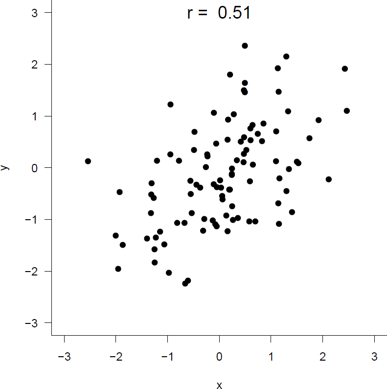
Figure 10.3: A random sample of size 100 from a distribution with \(\rho=0.5\).
In Figure 10.4 regression samples of size 10 have been taken from the same joint distribution, but
- on the left the values of \(x\) are chosen to be \(-2\) and \(+2\). We get \(r=0.84\).
- on the right the values of \(x\) are chosen to be \(-0.1\) and \(+0.1\). We get \(r=-0.46\).
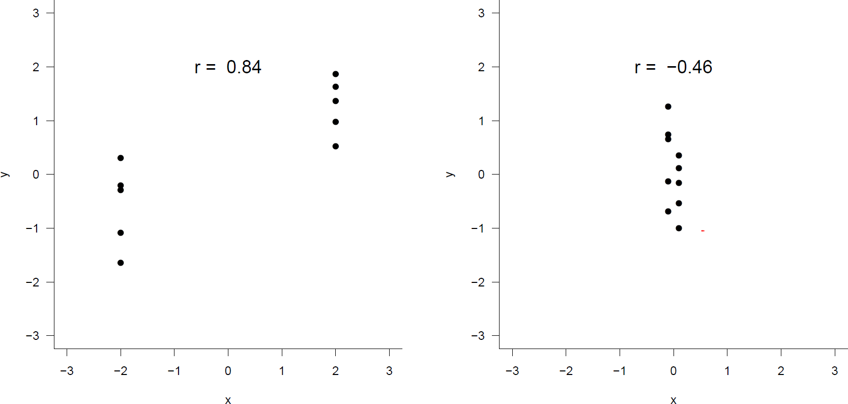
Figure 10.4: Left: \(x\)-values chosen to be only -2 or 2. Right: \(x\)-values chosen to be only -0.1 or 0.1.
The values chosen for \(x\) have a huge effect on \(r\). By choosing the values of \(x\) to be spread far apart we can make \(r\) as close to \(+1\) as we wish. If the values of \(x\) are chosen to be close together, \(r\) will be quite variable, but close to zero on average.
Summary
If regression sampling is used the value of \(r\) depends on the values of \(x\) chosen.
10.3.2 Examples of correlations of different strengths
Figure 10.5 gives random samples from distributions with correlations \(\rho=0\) (2 of them), \(\rho=\pm 0.3, \rho=\pm 0.7\) and \(\rho=\pm 1\). The data in the bottom plots in Figure 10.5 are both sampled from distributions with \(\rho=0\). However, the associations between the variables are very different. On the left there is no association. On the right there is quite strong non-linear association.
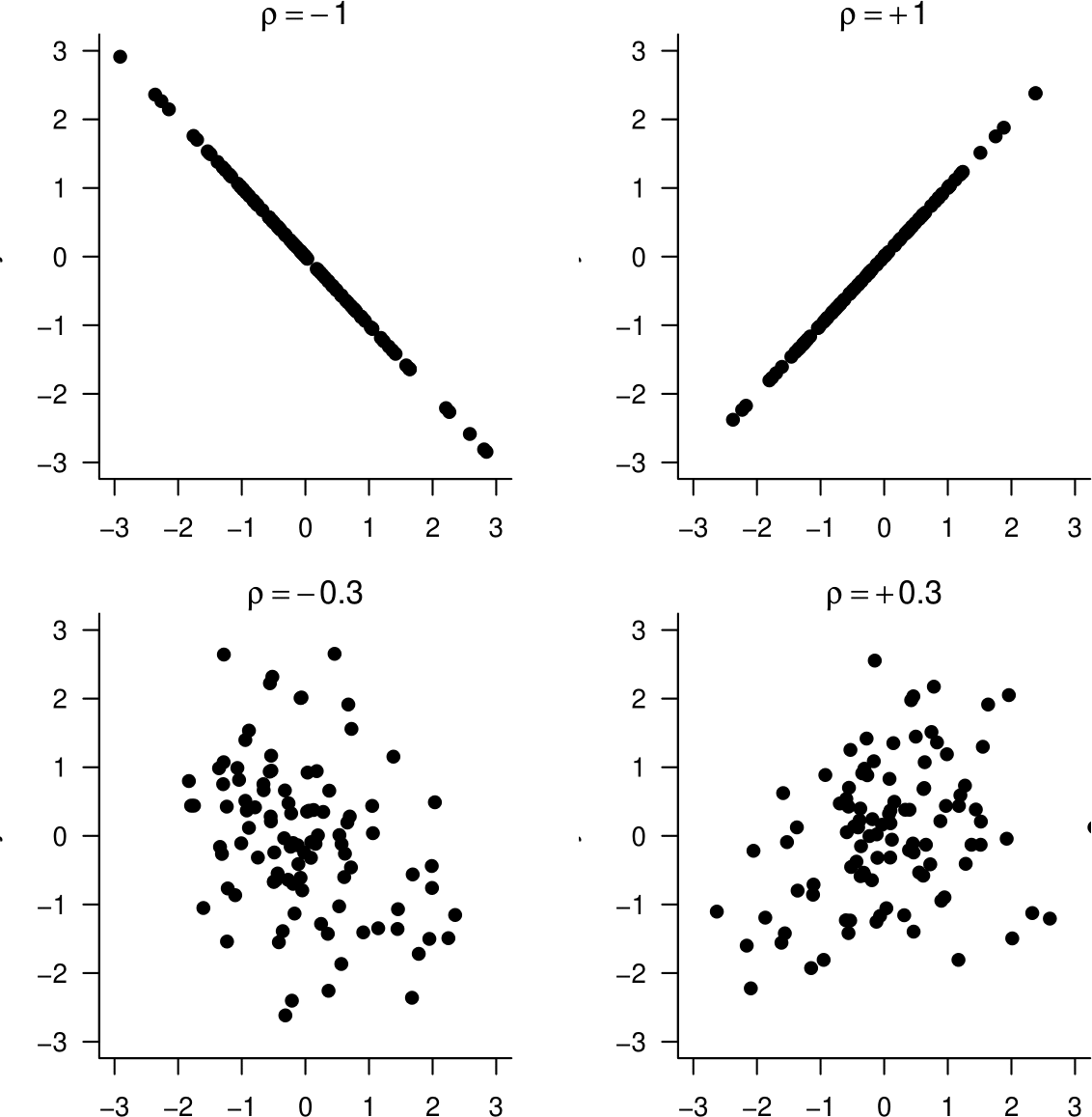
Figure 10.5: Samples from distributions with correlations \(\rho=0\) (2 of them), \(\rho=\pm 0.3, \rho=\pm 0.7\) and \(\rho=\pm 1\).
10.3.3 Beware missing data codes
Most real datasets have missing observations. For example, people may decide not to answer some of the questions on a questionnaire. It is quite common to use a missing value code (such as -9) to identify a missing value. We need to be careful not to confuse a numerical missing value code with actual data.
Consider the following situation, which is based on a real example.Someone is given data on two variables \(X\) and \(Y\). They calculate the sample correlation coefficient \(r\) and find that it is 0.95. They go back to the person who gave them the data and tell them that\(X\) and \(Y\) are strongly positively associated. The person is surprised: they expected the variables to be negatively associated. So they produce a plot of the data, shown on the left side of Figure 10.6.
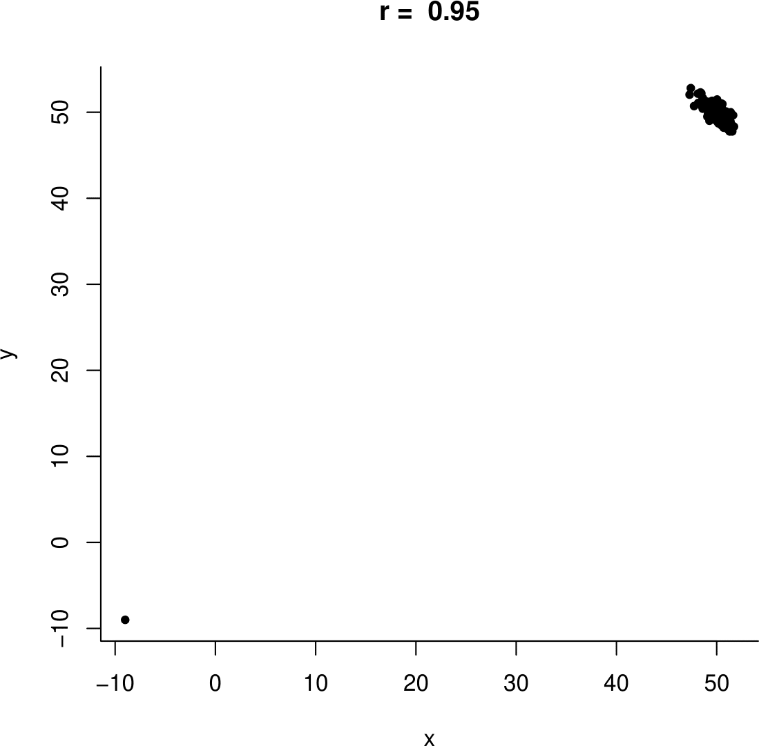
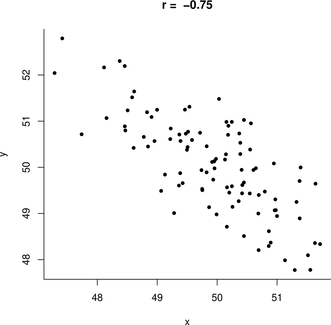
Figure 10.6: Example data. Left: including the ‘datum’ (-9,9). Right: with the missing value removed.
It is then clear that the large positive value of \(r=0.95\) is due the missing value (-9,-9) being included in the plot. Once this point is removed the sample correlation is negative, \(r=-0.75\), as expected. A plot of the data with the missing value removed in shown on the right side of Figure 10.6.
10.3.4 More guessing sample correlations
Figure 10.7 gives some scatter plots with their sample correlation coefficients.
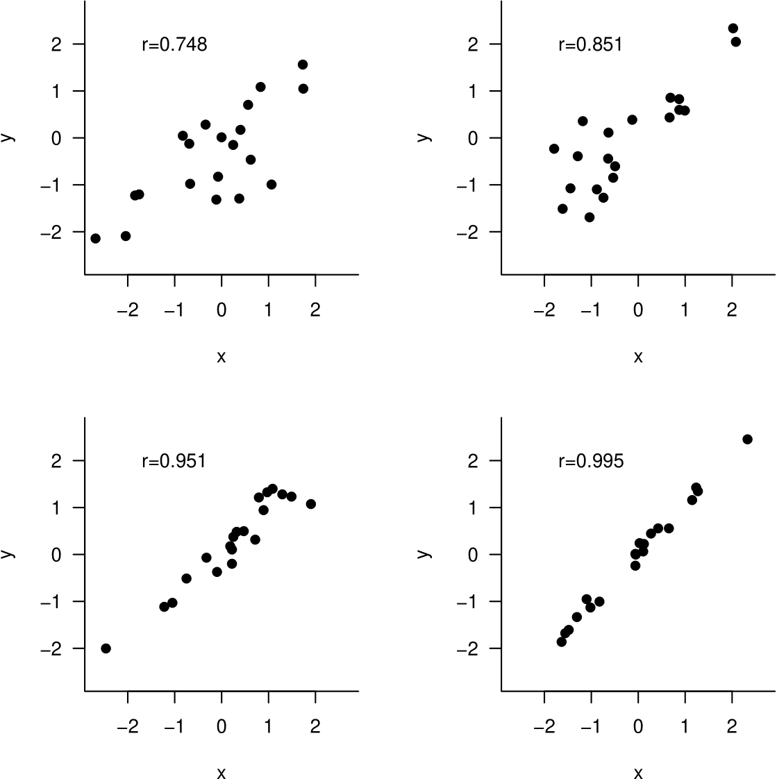
Figure 10.7: Some scatter plots and their sample correlation coefficient.
Based on these plots, you will probably be surprised by the fact that for the data plotted in Figure 10.8 the value of the sample correlation coefficient is 0.991. Can you guess what has caused this surprising value?
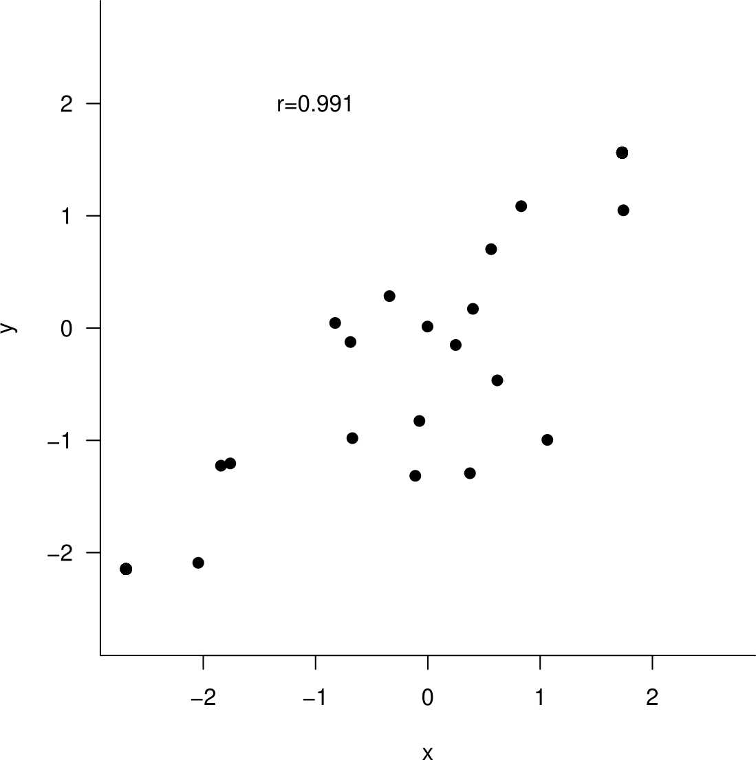
Figure 10.8: Can you guess the value of the sample correlation coefficient?
10.3.5 Summary
Correlation can be used when
- the data are a random sample from the joint distribution of \((X,Y)\),
- the association between \(X\) and \(Y\) is approximately linear.
Correlation should not be used, that is, it can be misleading, if
- the values of either of the variables are controlled by an experimenter,
- \(X\) and \(Y\) are associated non-linearly.
10.3.6 Anscombe’s datasets
It is very important to plot data before fitting a linear regression model or estimating a correlation coefficient. In 1973 F.J. Anscombe (Anscombe (1973)) created 4 datasets to illustrate the need for this. His data are given in Table 10.9. You discussed these data, and some other examples, in Tutorial 1.

Figure 10.9: Anscombe’s datasets.
The datasets have many things in common. For each of the 4 datasets:
- the sample size is 11,
- \(\bar{x}=9.00\), \(s_x=3.32\), \(\bar{y}=7.50\) and \(s_y=2.03\),
- the least squares linear regression line is \(y=3+0.5\,x\), with \(RSS\)=13.75,
- the sample correlation coefficient \(r=0.816\).
- (By the way, the values of Spearman’s rank correlation coefficient \(r_S\) are 0.818, 0.691, 0.991 and 0.500 respectively.)
Based on these sample statistics we might be tempted to conclude that the association between \(Y\) and \(X\) is similar for each of the 4 datasets. However, when we look at scatter plots of the data (Figure 10.10) it is clear that this is not the case. This demonstrates that summary statistics alone do not describe adequately a probability distribution.
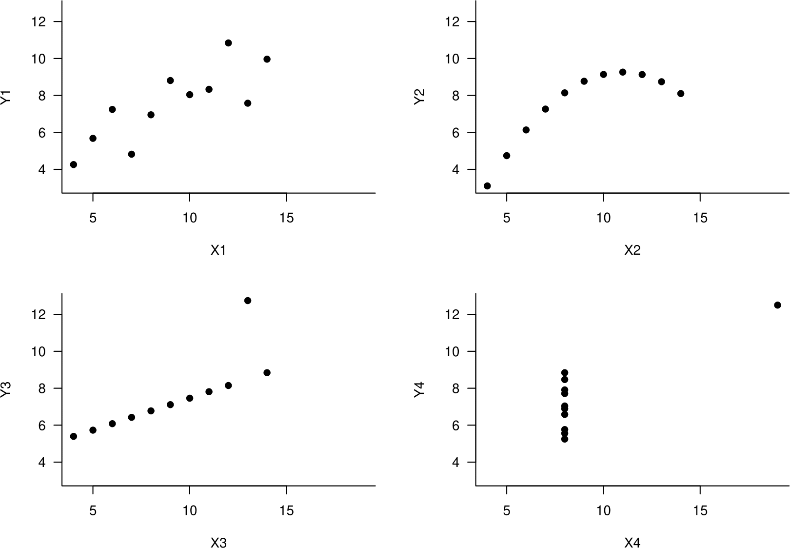
Figure 10.10: Scatter plots of Anscombe’s datasets. Top left: approximately linear association. Top right: perfect non-linear association. Bottom left: Perfect linear association apart from 1 outlier. Bottom right: the increase of 0.5 units in \(y\) for each unit increase in \(x\) suggested by the regression equation is due to a single observation.
10.3.7 We must interpret correlation with care.
Suppose that we find that two variables \(X\) and \(Y\) have a sample correlation which is not close to 0 and that a plot of the sample data suggests that \(X\) and \(Y\) may be linearly related. There are several ways that an apparent linear association can arise.
- Changes in \(X\) cause changes in \(Y\).
- Changes in \(Y\) cause changes in \(X\).
- Changes in a third variable \(Z\) causes changes in both \(X\) and \(Y\).
- The observed association is just a coincidence.
Points 3. and 4. show that correlation does not imply causation.
We finish with an example which may illustrate point 3. We have already seen the time series plots in Figure 10.11.
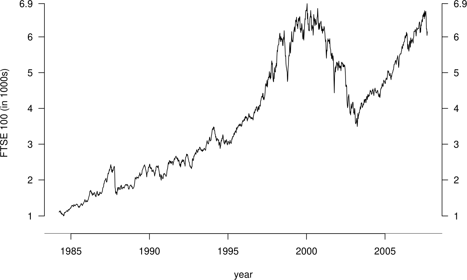
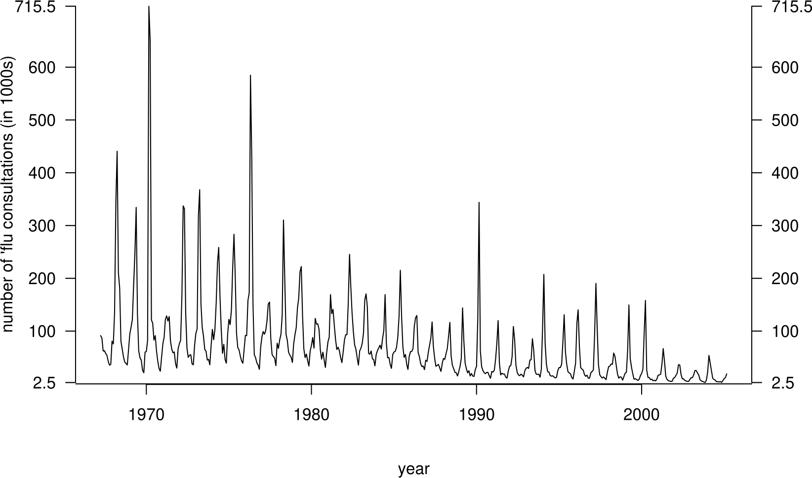
Figure 10.11: Weekly FTSE 100 closing prices against numbers of people seeing their doctor about flu over 4-week periods.
For the period of time over which these series overlap, we extract from the FTSE 100 data the weekly closing price that corresponds to each of the 4-weekly flu values. In Figure 10.12 we plot (on a log-log scale) these FTSE values against the flu values.
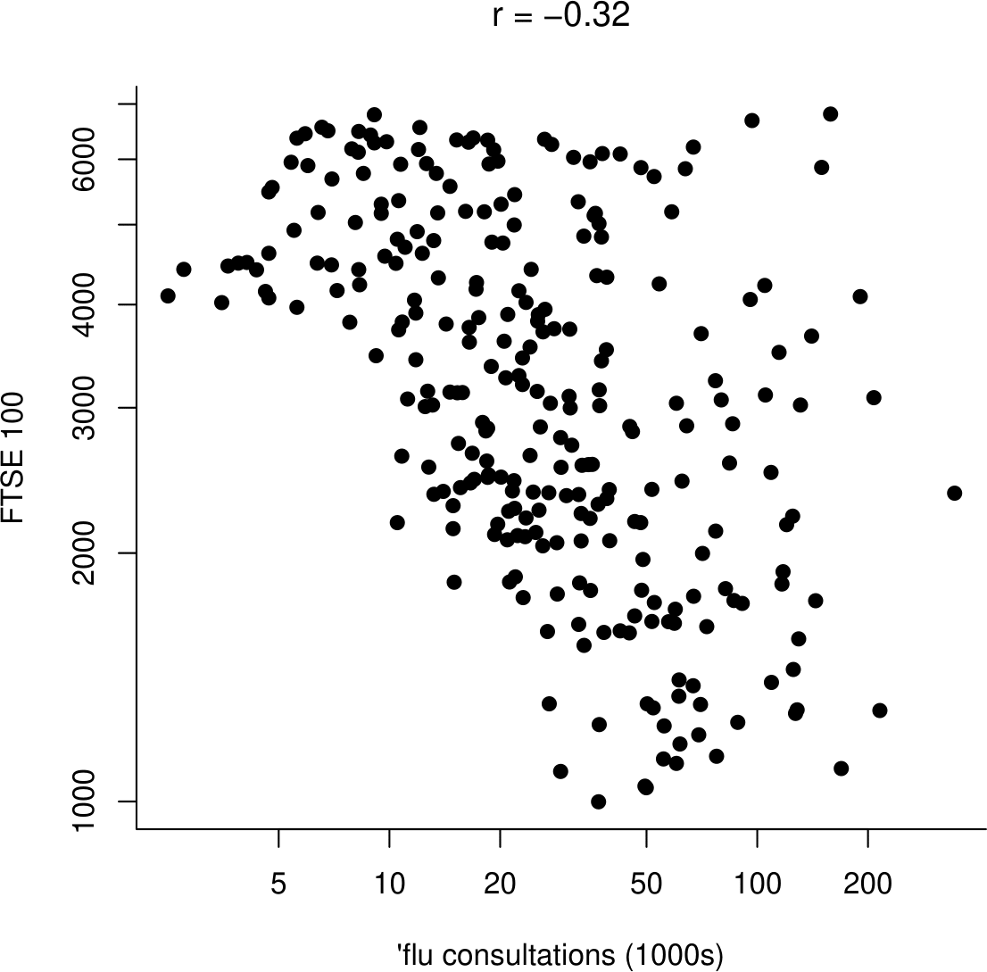
Figure 10.12: Weekly FTSE 100 closing prices against numbers of people seeing their doctor about flu over 4-week periods.
We see that there is weak negative association (\(r=-0.32\)) between the FTSE 100 and flu values. Does this suggest that flu causes the FTSE 100 share index to drop, or vice versa? This is not a ridiculous suggestion, but the time series plots suggest that the negative association is due to the fact that the FTSE 100 index has increased over time, whereas the number of people seeing their doctor about flu has decreased over time. There is a third variable, time, which causes changes in both the FTSE 100 and the incidence of flu.