Chapter 1 Introduction
We will introduce core ideas in Probability and Statistics. These ideas will be introduced informally and the mathematical level will be kept as elementary as possible. Examples of real investigations will be used to motivate discussion of the ideas and to illustrate simple statistical methods. In the course STAT0003 the material in STAT0002 will be revisited in a more formal way and more advanced concepts and methods will be introduced.
1.1 Real statistical investigations
We will spend some lecture time looking at examples of real investigations. Most of these are real investigations that have been described in real research papers. The first of these is introduced in Section 1.2. We will also use some much simpler teaching examples to illustrate statistical ideas and methods. However, teaching examples can give the impression that all statistical analyses are straightforward. In practice they are not.
“Most real-life statistical problems have one or more nonstandard features. There are no routine statistical questions; only questionable statistical routines.” David Cox
The vast majority of real investigations have at least one non-standard feature which means that we cannot simply throw the data into a computer and get it to spit out the answer. Statistical analyses require a lot of careful thought.
Ideally a statistician should be consulted before any data are collected. Often this is not the case. Commonly the statistician is presented with a set of data, with little explanation of its meaning or context. Sometimes the researcher has processed the raw data in some way before giving it to the statistician, perhaps removing information that seems, to them, to be unimportant. It is not uncommon for a researcher to ask a statistician to ``calculate a \(p\)-value for me’’. Real statistical analyses are never this simple.
Before starting a formal statistical analysis it is important to consider carefully the context of the problem. Data are not just numbers. They are recorded values of known variables, such as height or weight; they have units and an interpretation. Ask lots of questions of the people who produced the data, clarify the main objectives of the analysis and check for problems with the data. As we shall see in the in first example on the Space Shuttle, making a careless mistake early in an analysis can have dire consequences.
Many of the real-life problems we will consider required quite complicated data analyses reported in long research papers. I have summarised and simplified the details where necessary so that they are easier to understand. However, the main ideas and findings are unchanged. Some examples contain concepts and words which we will not define until later in STAT0002 or STAT0003. However, their meaning should be clear from the context of the problem. I hope that these investigations will convince you of the importance of the subject of Statistics.
1.2 Challenger Space Shuttle Catastrophe
Dalal, S. R., Fowlkes, E. B. and Hoadley, B. (1989) Risk analysis of the space shuttle: Pre-Challenger prediction of failure. J. Amer. Statist. Assoc. 84(408), 945–957.
On 28 January 1986 the space shuttle Challenger exploded shortly after its launch, killing the seven astronauts on board.
Could this accident have been predicted and therefore prevented?
The accident was caused by gas leaking from one of the fuel tanks into the intense heat produced by the booster rockets. Usually such leaks are prevented by rubber seals called O-rings. It was known that O-ring failure would destroy Challenger and its crew. Subsequent investigation revealed that O-rings do not seal properly at low temperatures. O-rings need to expand to fill the gaps through which fuel can leak. At low temperatures O-rings lose elasticity, cannot expand, and therefore cannot fill the gaps.
The night before the launch some engineers expressed concern about the possible effect of low temperature on O-ring peformance - the temperature forecast for the launch was 31\(^\circ\)F (-0.5\(^\circ\)C), much lower than on previous shuttle launches and below the temperature at which the O-rings were designed to work effectively. A meeting was called at which data (in table Table 1.1) resulting from the 23 previous launches were discussed.
| flight | date | damaged | temperature | |
|---|---|---|---|---|
| 2 | 2 | 12/11/1981 | 1 | 70 |
| 9 | 9 | 03/02/1984 | 1 | 57 |
| 10 | 10 | 06/04/1984 | 1 | 63 |
| 11 | 11 | 30/08/1984 | 1 | 70 |
| 14 | 14 | 24/01/1985 | 3 | 53 |
| 21 | 21 | 30/10/1985 | 2 | 75 |
| 23 | 23 | 21/01/1986 | 1 | 58 |
| 24 | 24 | 28/01/1986 | ? | 31 |
The third column contains the number of O-rings which showed some damage due to thermal distress after the flight. What do you notice about these numbers?
Figure 1.1, which illustrates these data graphically, was examined at the meeting. Despite some of the people present at the meeting suggesting that the launch should be postponed until the temperature reached the lowest temperature experienced in previous launches, the meeting concluded that there was no evidence of a temperature effect on the performance of O-rings and the launch went ahead.
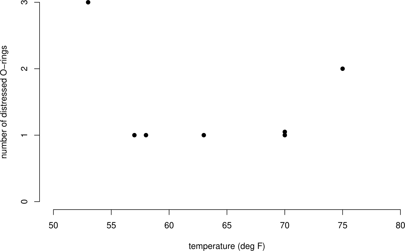
Figure 1.1: Number of damaged O-rings plotted against temperature, for flights prior to 28/01/1986. Flights showing no incidents of distress have been omitted. No clear association between the number of distressed O-rings and temperature is evident.
Flights giving zero incidents of thermal distress were not included in the graph. This was because it was felt that these flights did not contribute any information about the temperature effect. When the complete dataset (see Table 1.2 and Figure 1.2) is examined it is clear that these flights do contribute extra information.
| flight | date | damaged | temperature |
|---|---|---|---|
| 1 | 21/04/1981 | 0 | 66 |
| 2 | 12/11/1981 | 1 | 70 |
| 3 | 22/03/1982 | 0 | 69 |
| 4 | 11/11/1982 | 0 | 68 |
| 5 | 04/04/1983 | 0 | 67 |
| 6 | 18/06/1983 | 0 | 72 |
| 7 | 30/08/1983 | 0 | 73 |
| 8 | 28/11/1983 | 0 | 70 |
| 9 | 03/02/1984 | 1 | 57 |
| 10 | 06/04/1984 | 1 | 63 |
| 11 | 30/08/1984 | 1 | 70 |
| 12 | 05/10/1984 | 0 | 78 |
| 13 | 08/11/1984 | 0 | 67 |
| 14 | 24/01/1985 | 3 | 53 |
| 15 | 12/04/1985 | 0 | 67 |
| 16 | 29/04/1985 | 0 | 75 |
| 17 | 17/06/1985 | 0 | 70 |
| 18 | 29/07/1985 | 0 | 81 |
| 19 | 27/08/1985 | 0 | 76 |
| 20 | 03/10/1985 | 0 | 79 |
| 21 | 30/10/1985 | 2 | 75 |
| 22 | 26/11/1986 | 0 | 76 |
| 23 | 21/01/1986 | 1 | 58 |
| 24 | 28/01/1986 | ? | 31 |
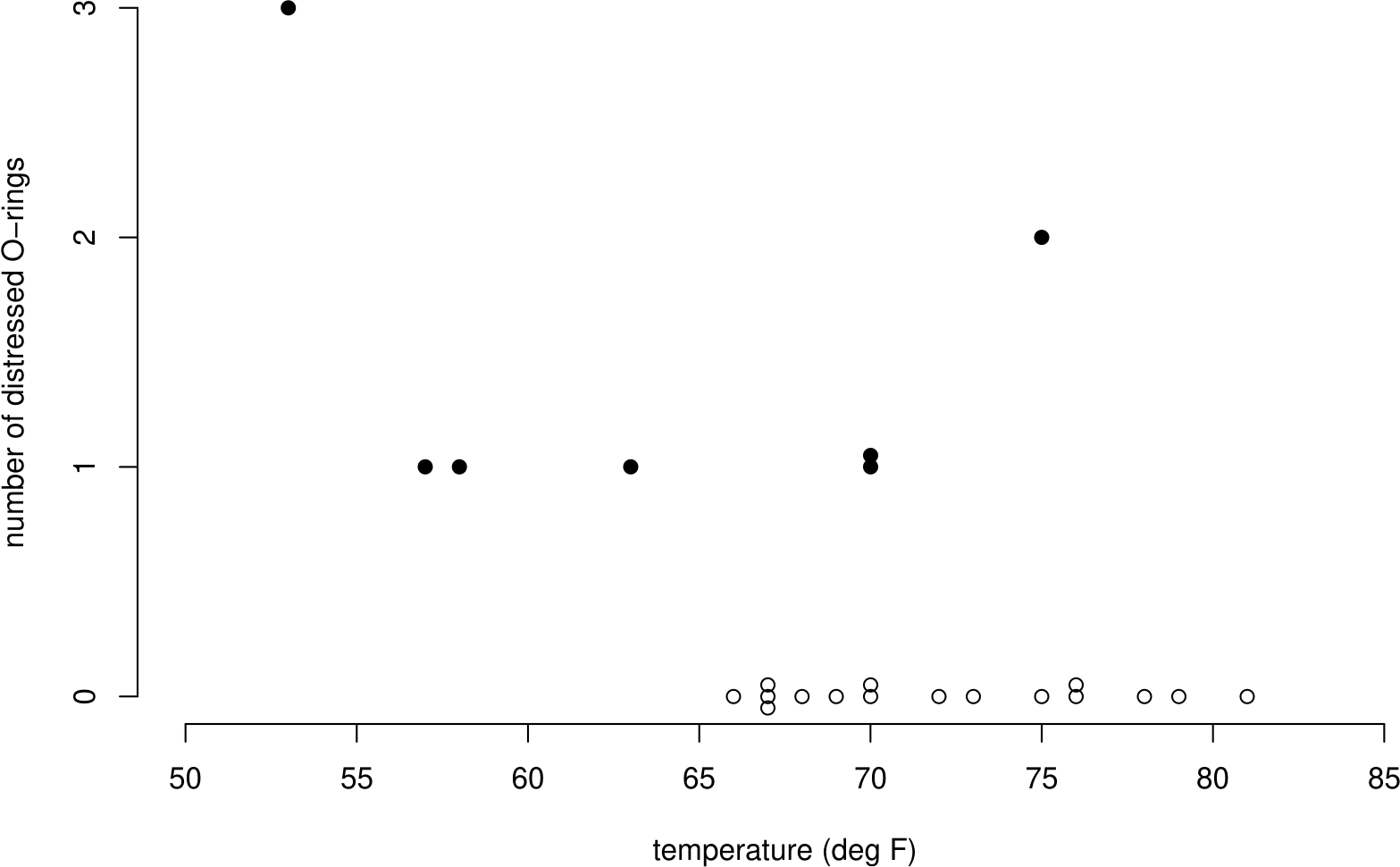
Figure 1.2: Number of damaged O-rings plotted against temperature, for flights prior to 28/01/1986. Flights showing no incidents of distress have been included as hollow circles. A clear negative association between the number of distress O-rings and temperature is evident.
The enquiry into the Challenger accident concluded that a more careful analysis of the O-ring data would have revealed the apparent effect of temperature on O-ring performance.
What can we learn from this example?
- Data analyses can have life and death consequences. Statisticians can be very important people!
- Statistical analyses should use all the data. In this example only a non-random sample of the data are used. Removing some of the data had dire consequences. Values of zero are still data.
- It is dangerous to extrapolate beyond the range of your data. No data were available below 50\(^\circ\)F. The forecast temperature of 31\(^\circ\)F was much lower than this.
After the accident Dalal, Fowlkes, and Hoadley (1989) estimated the probability of a catastrophic O-ring failure (that is, one that would cause an explosion) at 31\(^\circ\)F to be at least 0.13, which is large considering that seven lives were at stake. [To quantify their uncertainty they estimate that the probability is 90% certain to be between 0.03 and 0.37.] However, it should certainly be made clear that this estimate may not be at all reliable. For example, it could be that as temperature decreases below 50\(^\circ\)F the risk of an accident increases much more quickly than the statistical analysis suggests.
The plot in Figure 1.3 gives you an idea of one of the analyses that Dalal, Fowlkes, and Hoadley (1989) carried out. The sample proportions of O-rings showing thermal distress (number of O-rings showing distress divided by 6) are plotted against temperature. Also plotted is a smooth curve fitted to these data. The article Chapter 1: The Challenger Space Shuttle Disaster describes the model that defines this curve and the statistical methods used to estimate the model’s unknown parameters. [This analysis is beyond scope of STAT0002/0003. You may study this type of model in STAT0023.]
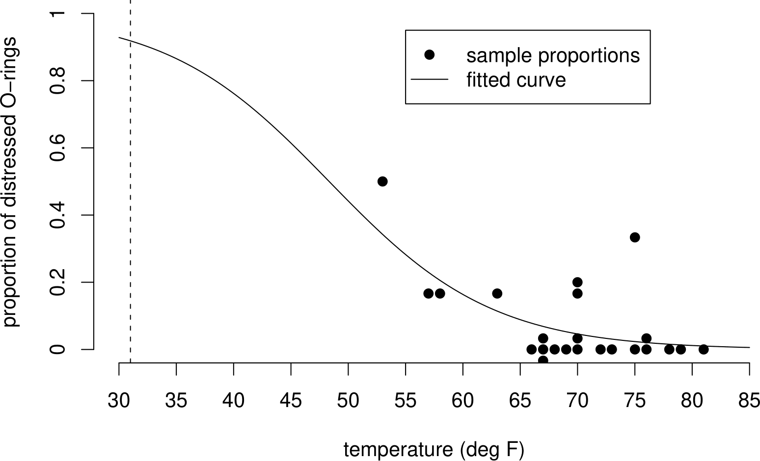
Figure 1.3: Proportion of O-rings showing some thermal distress plotted against temperature, with fitted logistic curve. The fitted curve reflects the apparent negative association between this proportion and temperature.
1.2.1 Uncertainty
Suppose there is a true curve, of the same general type as the one in Figure 1.3, which describes how the probability that an O-ring is damaged depends on temperature. We use the NASA test flight data to guess, or estimate the exact shape of this true curve. The curve in Figure 1.3 is not the true curve, it is an estimate of the true curve based on these data.
If NASA repeated their launches, at exactly the same temperatures, these new data on the number of damaged O-rings would not be the same as the old data and the shape of the new estimated curve would be different from the shape of the old estimated curve. It may be that these 2 curves are quite similar or it could be that they are very different. We could ask them, very politely, repeat this process many times to get a large number of different sets of data. Each set of data produces an estimated curve.
The dataset (and its estimated curve) we have is just one of many possible datasets that could be produced. We can imagine picking this dataset (and curve) at random from a big bag of possible datasets (and curves). These ideas are summarised in Figure 1.4.
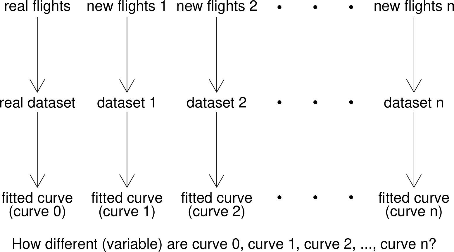
Figure 1.4: Diagram to illustrate the idea of repeating an experiment many times. Each simulated set of flights leads to its own dataset and fitted logistic curve.
Suppose that the estimated curves from the possible datasets are very similar to each other. We say that their variability is small. If this is the case then it doesn’t matter much which dataset we picked from the big bag of possible datasets: the results are similar for all datasets. Therefore, we can be fairly certain that the results we got from the dataset we have are close to the truth. Therefore the uncertainty surrounding the results is small.
On the other hand, if the estimated curves from the possible datasets are very different to each other then their variability is large. If this is the case then the results will be very different depending on which dataset we pick. Therefore, it is possible that the results we got from the dataset are very far from the truth. Therefore the uncertainty about the results is large.
We can see that variability and uncertainty are closely related. Small variability tends to produce small uncertainty, whereas large variability tends to produce large uncertainty. As we might expect the amount of data, (or, more precisely, the amount of information in the data) matters. Large datasets, with lots of information, tend to produce small variability in the results and therefore small uncertainty. Small datasets, with small amounts of information, tend to produce large variability in the results and therefore large uncertainty.
So, how can we quantify how much uncertainty there is in the space shuttle example? It is unlikely that NASA will carry out all their launches again just for us. However, it is possible for us to produce (simulate) on a computer our own, fake, datasets using the estimated curve in Figure 1.3. If this curve (and the assumptions used to produce it) are correct, this is equivalent to NASA carrying out more test flights: the simulated datasets have exactly the same statistical properties as the real dataset. In summary, we
- create a large number of fake (simulated) datasets;
- for each dataset we estimate a curve to describe how the probability of O-ring damage depends on temperature;
- examine how much the curves, and the estimate of probability at different temperatures vary between the simulated datasets.
Figure 1.5 shows 50 simulated curves and the curve estimated from the real data.
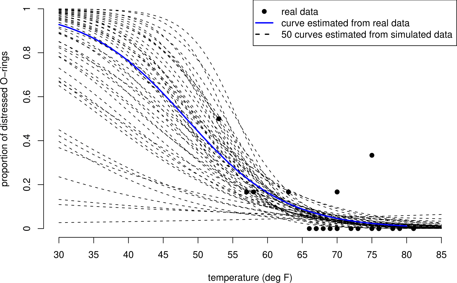
Figure 1.5: 50 curves fitted to simulated shuttle test flight data. The curves are similar over the range of temperatures observed in the data (53 to 81 degrees F), but vary greatly for lower temperatures, such as 31 degrees F.
There is a lot of variability in these curves. Notice that the curves are quite close to each other for high temperatures - where we have some data - but that they are very spread out for low temperatures - where we have no data. This is also illustrated in Figure 1.6, where, for each of four example temperatures we have plotted a histogram of the estimated probabilities from each simulated dataset, effectively taking vertical cross-sections through the curves in Figure 1.5.
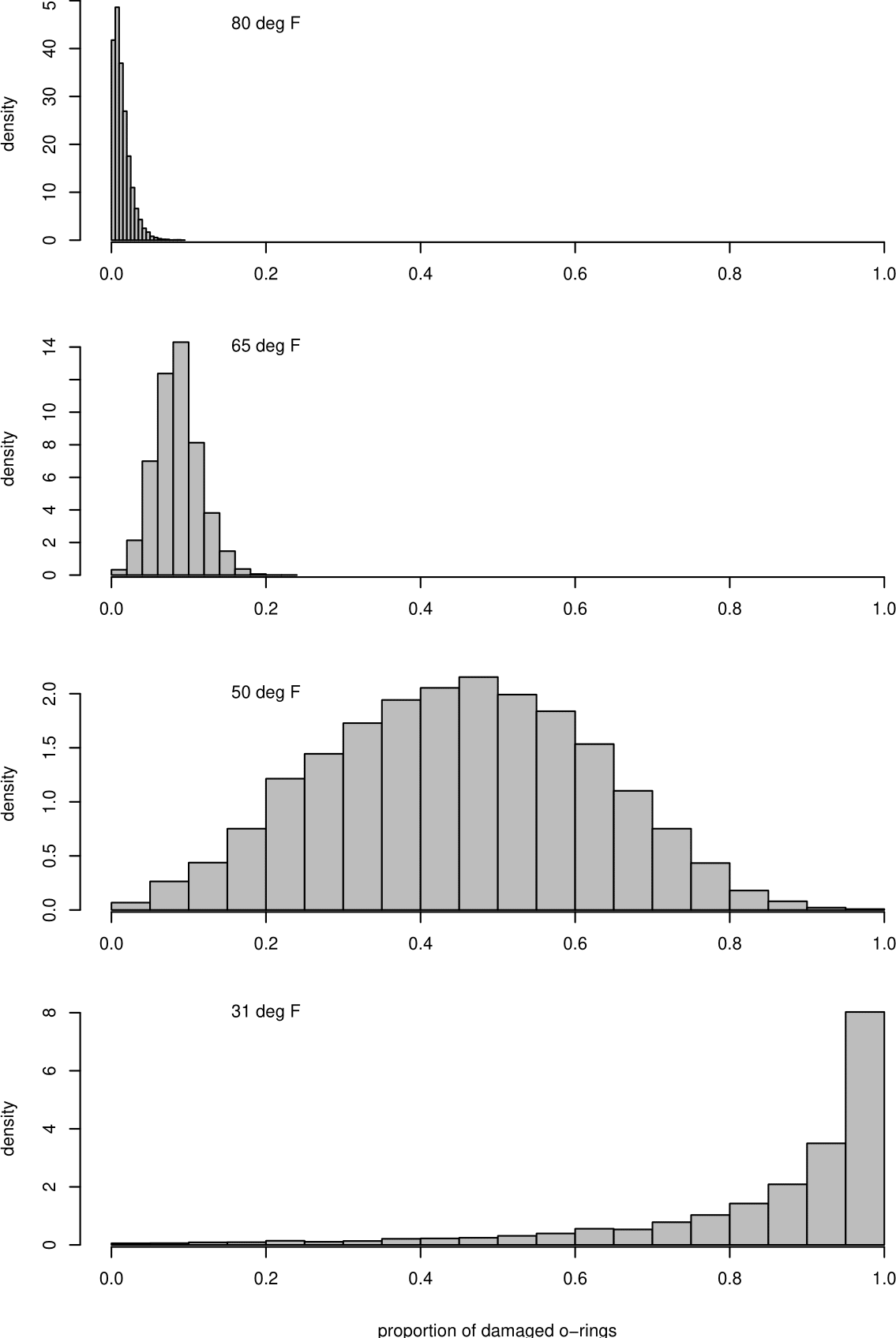
Figure 1.6: Histograms of estimated probabilities of O-ring damage at different temperatures.
In the histograms for 65\(^\circ\)F and 80\(^\circ\)F we see that the variability in the estimated probabilities is relatively small because the rectangles of the histograms are concentrated on a relatively small range of values. In contrast, the rectangles of histograms for 31\(^\circ\)F and 50\(^\circ\)F are spread over a much wider range of values, reflecting a larger amount of uncertainty. Even though 50\(^\circ\)F is not much smaller than the smallest temperature in the dataset (53\(^\circ\)F), the estimated probabilities at this temperature are spread from close to 0 to close to 1, approximately symmetrically distributed around a value that is close to 1/2. The estimated probabilities for 31\(^\circ\)F are also spread widely, but the shape of the histogram for 31\(^\circ\)F is asymmetric, with many estimated probabilities that are close to 1.
To show the effect of sample size (the size of the dataset) we simulate datasets which are larger than the real dataset and see how much the curves fitted to these data vary between the datasets. Figure 1.7 shows the estimated curves from 50 datasets, each of which is 10 times the size of the real dataset. Figure 1.8 shows curves for datasets which are 100 times the size of the original dataset. As the sample size increases the variability decreases and so the uncertainty decreases.
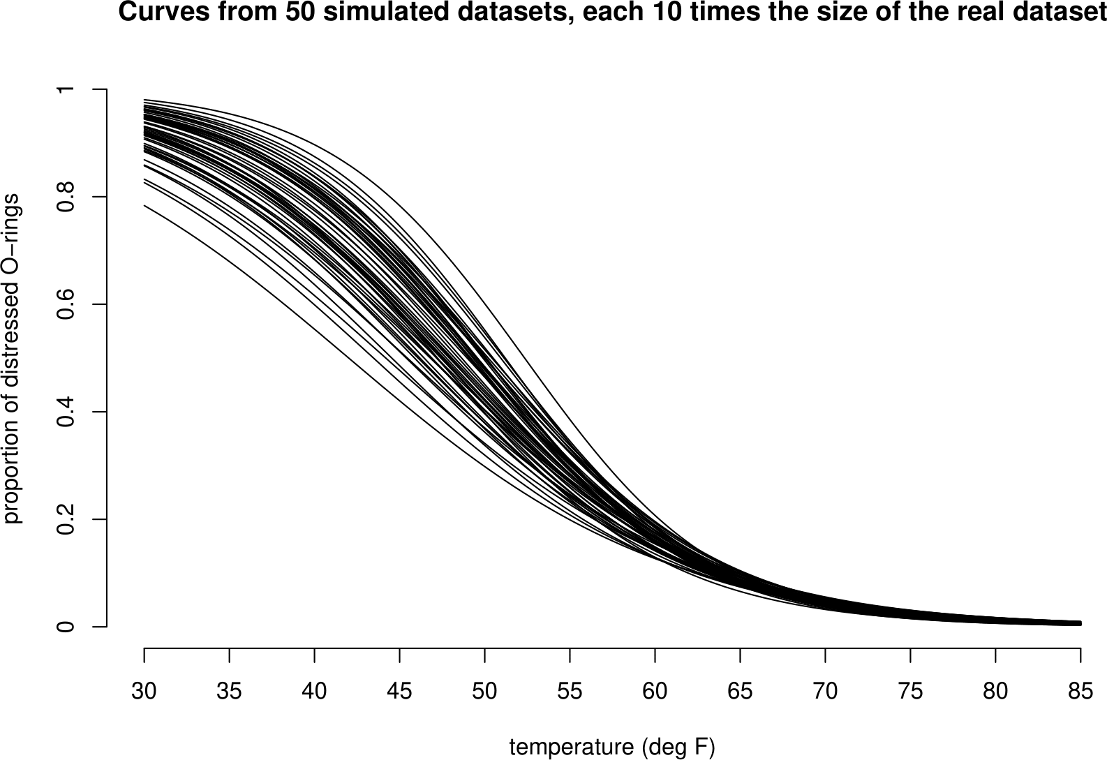
Figure 1.7: 50 curves fitted to simulated shuttle test flight datasets that are each 10 times the size of the real dataset. In comparision to the curves based on the real dataset these curves vary less, but are still most variable for low temperatures.
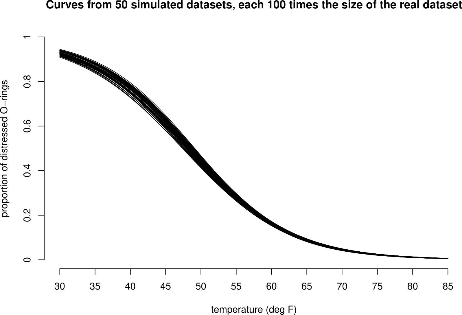
Figure 1.8: 50 curves fitted to simulated shuttle test flight datasets that are each 100 times the size of the real dataset. In comparision to the curves based on the real dataset these curves vary much less, but are still most variable for low temperatures.
1.3 A very brief introduction to stochastic simulation
This section contains words that we will not define until later in the course. Further information about stochastic simulation is available from the Stochastic Simulation section of the STAT0002 Moodle page.
In Statistics it is common to assess a statistical method based on how well it would perform if used repeatedly on a large number of new datasets, where we imagine that the new datasets have exactly the same statistical properties as the real data. In some cases it is possible to do this using mathematics. Alternatively, we can use a computer to produce some fake (simulated) datasets from a model that has been fitted to the real data. How can we do this?
Stochastic (stochastic simply means “involving randomness”) simulation is based on the ability to generate a random number \(u\) between 0 and 1. Stochastic simply means “involving randomness”. Your pocket calculator probably has a button to do this, perhaps called RAN#. It is possible to transform this number \(u\) so that it looks like it has been drawn from the distribution required, e.g. a binomial distribution or a normal distribution. If we produce a sequence \(u_1, u_2, \ldots, u_n\) of random numbers between 0 and 1 and transform them appropriately, then the transformed values will look like a random sample from the distribution required. Of course, because these values are produced by rule implemented by a computer they are not really random. However, if the rule is designed carefully, these values are close enough to being a random sample for our purposes.
For the purposes of the space shuttle experiment we simply need to simulate a 1 (O-ring distressed) with probability \(p\), and a 0 (0-ring not distressed) with probability \(1-p\). This is easy. If \(U\) is a random number between 0 and 1 then the probability that \(U < p\) is \(p\). Therefore, we define
\[\begin{equation} X = \begin{cases} 1 & \text{if } U < p, \\ 0 & \text{if } U \geq p. \end{cases} \tag{1.1} \end{equation}\]
For \(p=1/2\) this is like using a computer to flip an unbiased coin.
To simulate a fake space shuttle dataset we do the following for each of the 23 flights:
- set \(p\) to be the value of the fitted curve in Figure 1.3 corresponding to the flight temperature;
- generate 6 random numbers \(u_1, \ldots, u_6\) between 0 and 1;
- calculate \(x_1, \ldots, x_6\) using equation (1.1);
- calculate \(y=x_1+\cdots+x_6\), the total number of distressed O-rings.
We have assumed that the 6 O-rings have the same probability of becoming distressed and are distressed independently of each other. In Chapter 5 we will see that \(y\) is a value simulated from a binomial(6, \(p\)) distribution. We will use simulation several times in STAT0002 to study properties of statistical methods. All you need to know is that we can use a computer to produce fake data that look like they come from a certain probability distribution.